# Visualize Covid-19 cases in Shanghai from2022-03-01

# Acquire the reported Covid-19 cases in SH

  1. Scrap data from 上海本地宝
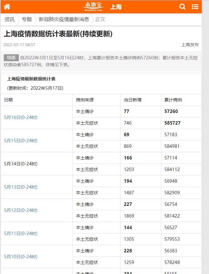
  2. scrap all items from table
1
2
3
4
5
6
# acquire html
html_resp = download(local_url)
assert html_resp, '数据获取错误'
html_soup = BeautifulSoup(html_resp, 'html.parser')
tr = html_soup.find('table').find_all('tr') # 查找表格内所有内容
table_info = tr[0].find_all('td')[0].text.replace('\t', '').replace('\n', '').split('\r')
  1. data structure
    SH_COVID19_DATA structure

    note: no death data in the table table_url

date NewInfection NewAsymptomatic AllInfection AllAsymptomatic Death
2022-05-12 227 1869 56754 581422 0
2022-05-11 144 1305 56527 579553 0
  • find all these items in the table
    main codes below:
    1
    2
    3
    4
    5
    6
    7
    8
    9
    10
    11
    12
    13
    14
    for index, row_data in enumerate(table_row):
    # from evev rows get 日期-date 本土确诊-NewInfection 累计确诊-AllInfection
    if index % 2 == 0:
    cn_date = row_data.find_all('td')[0].text.strip('\n')
    # change to datetime string
    date = deal_cn_date(cn_date, 2022) # add later
    NewInfection = int(row_data.find_all('td')[-2].text.replace('\n', '').replace('\r', ''))
    AllInfection = int(row_data.find_all('td')[-1].text.replace('\n', '').replace('\r', ''))
    # print(f'date: {date}, NewInfection: {NewInfection}, AllInfection: {AllInfection}')
    # from odd rows get 本土无症状-NewAsymptomatic 累计无症状-AllAsymptomatic
    NewAsymptomatic = int(table_row[index + 1].find_all('td')[-2].text.replace('\n', '').replace('\r', ''))
    AllAsymptomatic = int(table_row[index + 1].find_all('td')[-1].text.replace('\n', '').replace('\r', ''))
    # print(f'NewAsymptomatic: {NewAsymptomatic}, AllAsymptomatic: {AllAsymptomatic}')
    all_daily_data.append([date, NewInfection, AllInfection, NewAsymptomatic, AllAsymptomatic])

# Transform and save data

  1. dict data form:
    SH_COVID19_DATA:

{“Date”:list[date], “NewInfection”: list[int], “NewAsymptomatic”: list[int],
“AllInfection”: list[int], “AllAsymptomatic”: list[int], “Death”: list[int] }

  1. transform to pandas dataframe
1
2
3
4
5
6
7
8
9
10
11
12
def dict_to_DataFrame(data_dict: dict):
"""
change dict form data to dataframe form and return
:param data_dict:
:return:
"""
new_dict = dict()
# change to the data from to standard dict {'key': pd.Series([list],index=[index])}
for key in data_dict:
num = len(data_dict[key])
new_dict[key] = pd.Series(list(data_dict[key]), index=list(range(num)))
return pd.DataFrame(new_dict)
  1. save pandas dataframe data to sqltable,csv,xlsx,json
    main code:
1
2
3
4
5
6
7
8
9
10
11
12
13
14
15
16
17
18
# sqlite table
cxn = sqlite3.connect(sql_db)
pd_data.to_sql(name=table_name, con=cxn, if_exists='replace', index_label='id')

# excel file
# excel writer
excel_writer = pd.ExcelWriter(excel_file_path)
pd_data.to_excel(excel_writer)
excel_writer.save()
print(f'save to excel xlsx file {excel_file_path} successfully')
# csv file
csv_file_path = os.path.join(save_path, filename + '.csv')
pd_data.to_csv(csv_file_path)
print(f'save to csv file {csv_file_path} successfully')
# json file
json_file_path = os.path.join(save_path, filename + '.json')
pd_data.to_json(json_file_path)
print(f'save to json file {json_file_path} successfully')

# plot data

via plotnine

  1. line-plot
1
2
3
4
5
6
7
8
9
10
11
12
13
14
15
16
17
18
19
20
21
22
23
24
# import pandas as pd
def plot_Covid19_SH_data(pd_data: pd.DataFrame):
"""
plot the SH_COVID19_DATA
:param pd_data:
:return:
"""
pd_NewCases = pd_data.drop(columns=['Death', 'AllInfection', 'AllAsymptomatic'])
melt_df = pd.melt(pd_NewCases, id_vars=['Date'], var_name='COVID-19-Cases', value_name='value')
area_fill_plot = (ggplot(melt_df, aes(x='Date', y='value', group='COVID-19-Cases', color='COVID-19-Cases'))
+ geom_area(aes(fill='COVID-19-Cases'), alpha=0.7, position='identity')
+ geom_line(aes(color='COVID-19-Cases'), size=0.75) + # color='red',
scale_x_date(date_labels="%m-%d", date_breaks='5 days')
+ scale_fill_hue(s=0.9, l=0.65, h=0.0617, color_space='husl') + xlab("2022@ShangHai")
+ ylab("Covid-19 Cases")) +
theme(legend_position=(0.25, 0.75),
axis_title=element_text(size=20, face="plain", color="#ec5519"),
axis_text=element_text(size=10, face="plain", color="#E7298A"),
legend_text=element_text(size=18, face="plain", color="#E7298A"), figure_size=(18, 18),
dpi=100)


print(area_fill_plot)

results:

Areaplotcases

  1. Calendar plot
1
2
3
4
5
6
7
8
9
10
11
12
13
14
15
16
17
18
19
20
21
22
23
24
25
26
27
28
29
30
31
32
33
34
35
36
37
38
39
40
41
42
43
44
45
46
47
48
def calendar_map_Covid19data_SH(cal_data: pd.DataFrame):
"""
draw a calendar map with the pd data of [date,case]
pd data example:
Date NewAsymptomatic
0 2022-05-12 1869
1 2022-05-11 1305
2 2022-05-10 1259
3 2022-05-09 2780
4 2022-05-08 3625
:param cal_data: pd.Dataframe data with two columns [date,value]
:return:
"""
df = pd.melt(cal_data, id_vars=['Date'], var_name='variable', value_name='value')
df['Date'] = [datetime.datetime.strptime(d, "%Y-%m-%d").date() for d in df['Date']]
df['year'] = [d.year for d in df['Date']]
df = df[df['year'] == 2022]
df['month'] = [d.month for d in df['Date']]
month_label = ["Jan", "Feb", "Mar", "Apr", "May", "Jun", "Jul", "Aug", "Sep", "Oct", "Nov", "Dec"]
df['monthf'] = df['month'].replace(np.arange(1, 13, 1), month_label)
from pandas.api.types import CategoricalDtype
cat_dtype = CategoricalDtype(categories=month_label, ordered=True)
df['monthf'] = df['monthf'].astype(cat_dtype)
df['week'] = [int(d.strftime('%W')) for d in df['Date']]
df['weekay'] = [int(d.strftime('%u')) for d in df['Date']]
week_label = ["Mon", "Tue", "Wed", "Thu", "Fri", "Sat", "Sun"]
df['weekdayf'] = df['weekay'].replace(np.arange(1, 8, 1), week_label)
catWeek_dtype = CategoricalDtype(categories=week_label, ordered=True)
df['weekdayf'] = df['weekdayf'].astype(catWeek_dtype)
df['day'] = [d.strftime('%d') for d in df['Date']]
df['monthweek'] = df.groupby('monthf')['week'].apply(lambda x: x - x.min() + 1)
calendar_plot = (ggplot(df, aes('weekdayf', 'monthweek', fill='value')) +
geom_tile(colour="white", size=0.1) +
scale_fill_cmap(cmap_name='OrRd', name='New Cases') +
geom_text(aes(label='day'), size=8) +
facet_wrap('~monthf', nrow=1) +
scale_y_reverse() +
xlab("COVID-19 2022@ShangHai") + ylab("Week") +
theme(strip_text=element_text(size=16, face="plain", color="black"),
text=element_text(family="SimHei"),
axis_title=element_text(size=14, face="plain", color="deepskyblue"),
axis_text=element_text(size=10, face="plain", color="#E7298A"),
legend_position='left',
legend_background=element_blank(),
aspect_ratio=0.85,
figure_size=(9, 5),
dpi=100))
print(calendar_plot)

results:

Calendarplotcases